26th October - 19th November 2011
Opening: 26th October 2011
Colour and Substance
Willard Boepple
John McLean
William Perehudoff
Tim Scott
Colour and Substance

 Colour and Substance.
This show is perhaps a little unusual in as much as it is a group show without a theme. It comes down to this: that we thought these artists would work well together, that the look and feel of their work would be complementary. We make no apology for this perspective, and consider it the best thing in the world to be able to bring together painting and sculpture that is just simply exciting to look at, one thing next to another. Like the artists themselves, we don’t know the outcome. All of these works, apart from the paintings of Bill Perehudoff, are very new.
Bill Perehudoff and Tim Scott are two established abstract artists of long-standing renown who have both had solo shows at Poussin. John McLean, of course, is a familiar favourite of visitors to the gallery, having featured in a handful of solo and mixed shows here. We especially welcome his American friend, the highly-regarded sculptor Willard Boepple, a new and stimulating addition to our forum. We are indebted to all four artists for agreeing to contribute to this show, in what amounts to an act of faith, both in our judgement in putting them together, and in their own abilities to give voice to their art in such eminent company. They are all artists who wish their art to speak for them; nevertheless, here is what they (briefly and not a little reluctantly) have to say about their new work:
Willard Boepple writes:
Four years ago I was asked to design a broadcast tower for a radio station in Syracuse, New York. It was a dream project. Responding to the structural requirements of a 40-meter steel tower I tried variously to inhabit the structure, manipulate it, ignore it and stand independent of it. It was an adventure. These sculptures flow from those efforts and focus on themes or movements within the supporting tower frame. Eventually the framework began to function as a sort of engaged pedestal, a part of and support for the whole.
I want my sculpture to speak directly, without explanation, apology or irony; to be open and clear like a ringing melody. The job of my work is to create meaning, the way a melody creates meaning and brings form to life. It has no other function than to do this and if luck is smiling in the studio that day, perhaps it will happen.
For Tim Scott, who is mostly known for his forged steel sculpture, working in plywood is a new departure:
Whilst being away from the studio, I occupied myself with making maquettes for sculptures to be made up later. These were fashioned from thin card cut into small shapes and laminated together with glue to make a rigid material. Overall sizes were roughly within a 12" (30cm.) x 12" x 12" format.
When confronted later with the decisions as to how they were to be made full scale, my immediate thoughts centred on sheet materials that would simulate the paper structures. In turn, I rejected the obvious sheet metals (steel, aluminium, copper, tin etc.) as being over-dependent on the methods of working and fixing; welding, braising, gas cutting and so on. Similarly, decorative sheet materials such as acrylic, Formica and even timber boarding, didn’t seem to fit the bill either. At this point, thinking again about lamination as the raison d’être of what I was seeking, I hit on the idea of using plywood. This material is reasonably strong and durable and also flexible. Above all, it is in itself a laminated material; its nature arises from that fact.
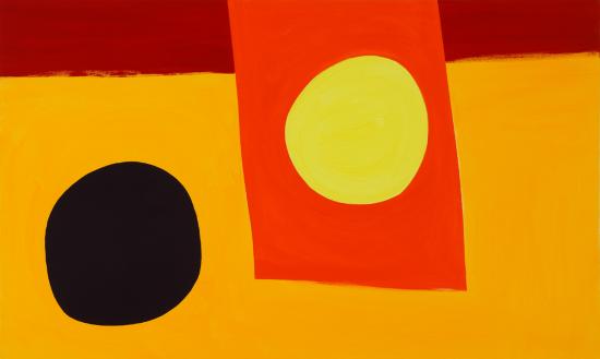
Lastly, John McLean writes about his own work and that of his Canadian fellow-painter Bill Perehudoff, highlighting in particular the use of colour in sculpture and architecture:
The boundaries between painting, sculpture and architecture are indefinite. For me, Le Corbusier’s stained glass and enamel doors are as integral to his hilltop chapel at Ronchamps as the sculpture and windows are to Chartres cathedral.
My ‘Traffic Yellow’ sculpture has an architectural aspect. Though lacking a corner, it is, in essence, a two-storied cuboid. When I put that triangle across the missing vertex, the red shape brought the entire space to life. The diagonal edge of the triangle seems to strive for the upper and also slither down to the lower level, accompanied by the play between all the negative shapes. The latter make the tune while the big sheets make the harmony. I use the same vocabulary in my paintings.
For several centuries poloychromy became rare in sculpture, but since Cubism it has had new vigour. Colour was not a feature of those few sculptures I have shown in the past. But recently I have found ways of using it that talk back to me. My paintings and sculpture now seem indivisible.
In the 1990’s I was very excited by John Elderfield’s Matisse show at MOMA in New York, and also, not long after, the Miró exhibition in Barcelona. From then on I started using much more saturated colour which led naturally to spatial effects that were new to me. Transferring these jumps in tone as well as hue to three-dimensions was a revelation. And I found I could use illusion through colour in my sculpture, while still working abstractly.
Bill Perehudoff’s use of strong hue has also been an inspiration. He too has had his forays into three-dimensions. For example, the architect Frank Gehry once awarded him a prize for a lovely invention: planks of colour arrayed under shallow water. Years ago, when I showed Bill a new painting, he remarked that we were on the same wavelength. I was flattered, and think he was right. Colour is central to both our enterprises.
The relative simplicity or complexity of all the work we show at Poussin is very much a matter for the artists’ own sensibilities. What links all the artists at Poussin is a belief in finding meaning within visual form, and a consequent mistrust of art that hints at or openly professes a hidden message or profundity. If you want ‘sublime’, you have to get on and paint it. As Oscar Wilde put it, ‘It is only shallow people who do not judge by appearances. The mystery of the world is the visible, not the invisible’.
Poussin Gallery 2011
For more information or hi-res images please contact the gallery:
mail@poussin-gallery.com
020 7403 4444